
Creating A Brand
- Marketing
- 20th April 2018
- Autumn Palmer
Music is not just about the sound. You have to look the part, and make a good first impression. Here's our guide to creating a brand for your music!
What is the first thing that most of your potential fans will see from you? Your image. Your brand. Your look. So it goes without saying that you have to have a good one. It has to stand out. It has to reflect your music. You wouldn’t sell lettuce in burger packaging, so you have to look how you sound, and you have to look good. Here are some tips for building a good, cohesive brand.
The Colours.
This is more important than you think. The human mind associates certain colours with certain emotions. Blue is cool, and fresh. Red is angry, feisty and hot. You have to choose colours that reflect the mood that your music gives. Black and white will work for pretty much anything, but pretty much everything ever has used black and white as their colour scheme at some point in their careers. So please, don’t rely on this most basic of colour schemes to sell your music. It has to be appealing. McDonald’s use the combination of red and yellow because it evokes a subconscious desire to eat, and there they are with food! Colour schemes should also apply to everything you do. all your fonts, images and graphics should follow your colour scheme.
Some artists change their colour schemes per release, which is smart, as the mood of their music might change per release. Arctic Monkeys did this with their albums. Their first album was very Sheffield-oriented and working class, so they used the image of a man smoking as their album cover. Their second album was similar, but experimented with broader subjects and deeper lyrics, so the album used a picture of a house, with embedded graphics with brighter colours. Their third album was far more moody and less energetic, so they used grungy, murky colours like deep green and purple.
For en example of a band who use colours well, check out our review of Hanover!
Wardrobe.
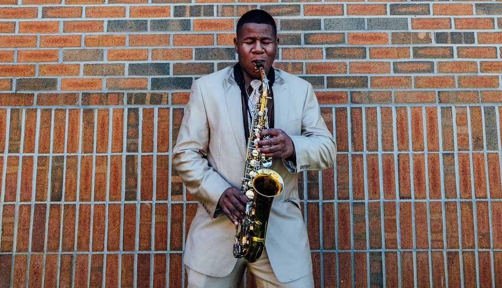
It goes without saying that you have to dress the part. Too many artists just think “I’ll just wear my normal clothes as casual is our style”. NO. You have to look like a band, not just four friends from secondary school. You have to dress like you sound. If someone who doesn’t know anything about your band, they have to be able to get a decent idea about your sound. You wouldn’t dress in goth attire and then play feelgood indie pop, would you? A certain level of casual is okay, provided it still reflects your music and you don’t just look like you’re on your way to the Tesco. (See our review of SPINN for an example of a band who pulls this off!) Also, take into account your target audience. Ideally you want to be dressing like them, so they can relate to you and your music and are more likely to take an interest in your band. Oasis look(ed) like a group of Manchester football goers, which reflects the mood and sound of their music. If you sound classy, look classy. If you sound dirty, look (maybe not dirty) grungy and moody.
Fonts & Logos.
As weird as it sounds, what fonts you use can dictate how people actually read what you write. Say you’ve created a tour poster, you need to use a font that not only works with your imagery and colour scheme, but that reflects (yet again) the sound and mood of your music. If you are a nice, summery indie band, don’t be writing in a harsh, metal style font. You logos also need to work in the same way. Logos can however be a tough one. Your logo can actually be just your name in your chosen font, or it can be a symbol or image that sums up your band name. You Me At Six use a moon that has most of it in shadow, which is easily recognisable and also marginally represents the name of your act. You don’t NEED one, but it can be useful to have one symbol that is used across all your merchandise and artwork. But if you do have one, it has to work with your fonts, images and colours.
Check our review of LIFE to see a band who have their logos nailed!
Voice.
Aside from how you are seen, it’s important to consider how you sound. And I don’t mean musically. As an artist, you need to have a voice that also reflects the attitude of your music. You need to consider if you want to sound happy, dark, mysterious, moody, strong, sweet and anywhere in between. This does not have to be the same as your real life individual voice. Think of it like playing a character, you need to be the voice that represents your music and makes people in your target audience more liable to relate to you. Look at Keith Flint from the Prodigy. Do you think he goes round his mother’s house and screams about anarchy and sets stuff on fire? How your voice is perceived by others is crucial to your success, so take into account who is listening, and who you want to appeal to.

Cohesion.
Here’s the cruncher. Everything you create towards your brand has to work together. There is no point having a great logo, colour scheme, font and image if they don’t work together. You wouldn’t create a wonderful tomato and herb sauce and drape it across a raspberry sundae, so don’t do the same with branding. Here at Kycker, we like to compare music to food. Bite us, no pun intended.
So that’s a wrap on our guide to creating a brand. If you take one thing away from this, take this. Everything needs to work together to create a full, cohesive brand that gives an honest, appealing front to your music. And that is how you create a good brand.